
Results of Online Usability Study of Apollo Program Websites
by Tom Tullis
Originally posted March 21, 2008; Last updated April 15, 2008

|
Results of Online Usability Study of Apollo Program Websitesby Tom Tullis |
|
|
Table of Contents |
An online usability study of two websites about the Apollo Space Program (NASA and Wikipedia) was conducted. Each participant attempted four tasks from a full set of nine using one of the sites. A total of 130 people completed the study. Task completion status and task time were automatically recorded, as were responses to a variety of post-study rating scales and open-ended questions, including the System Usability Scale (SUS). All performance metrics (task completion, task time, task efficiency) showed that the participants performed significantly better using the Wikipedia site. Similarly, all but one of the self-reported metrics showed that the Wikipedia site was perceived as being significantly easier to use. The one exception was that the NASA site was rated as marginally more visually appealing. Extensive comments on both sites are consistent with these findings and give additional insight into aspects of the sites that could be improved.
As an illustration of online usability testing, I created a test comparing two live websites containing information about the Apollo Space Program:
I chose the Apollo Space Program simply because I've been a "space cadet" since I was a kid, and I grew up in the 1960's, closely following the U.S. space program. I chose those two sites because they struck me as being very different approaches to presenting similar sets of information.
When a potential participant went to the starting page, an overview of the study was presented. If the user then entered an email address and clicked on "Next", a set of instructions was shown. As explained in those instructions, when the user clicked on "Begin Study", two windows then opened, fitting the top and bottom of the screen:
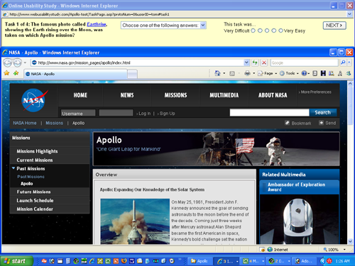
The top window presented the first task to be performed. The bottom window presented one of the two sites being evaluated. Each participant was randomly assigned to one site or the other and only used that site for the entire study. The users were free to use any of the features of the site. However, they were instructed not to use any other sites to find the answers (e.g., Google).
Each task included a drop-down list of possible answers, such as this example:
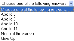
"None of the above" and "Give Up" were always given as options, although "None of the Above" was never a correct answer. Three to six other options were listed, one of which was the correct answer to the question. The user was required to select an answer (which could be "Give Up") in order to continue to the next task.
The user was also asked to give a rating to the task on a 5-point scale from "Very Difficult" to "Very Easy", although this rating was not required:
![]()
Nine tasks were used in the study:
The multiple-choice options, and correct answer, for each task can be seen in this list of task options.
Each participant was given a randomly selected four tasks to perform from the full set. (Early participants in the study actually just got three tasks, before I decided to increase it to four.) The four tasks for each participant were presented in random order so that any practice effects would be distributed across the tasks.
I came up with a set of candidate tasks before studying either site based on my own knowledge of the Apollo Program. They at least seemed to me to be questions that visitors to these sites might be interested in. I then eliminated any tasks that I couldn't find the answer to on both sites. That left the nine tasks above.
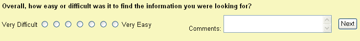
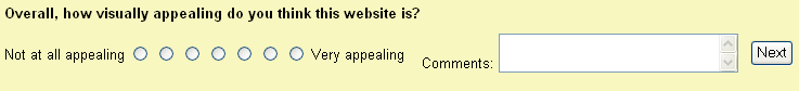
After all four tasks, the participant was asked to rate the site on two 7-point scales, each of which had an associated comment field:
This was followed by two open-ended questions:
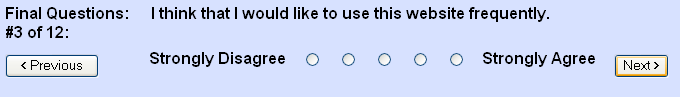
The last part was an adaptation of the System Usability Scale (SUS), adapted for use in evaluating websites. The original version of SUS was developed by John Brooke while working at Digital Equipment Corporation in the UK in 1986. These rating scales were introduced with the instruction, "For each of the following statements, select the response that best describes your overall reactions to the website you used today." Each of the ten rating scales was presented by itself, with Previous & Next buttons to move between them, as in this example:
The exact wording of each of the ten statements was as follows:
Each statement was accompanied by a 5-point scale of "Strongly Disagree" to "Strongly Agree". Note that half of the statements are positive and half are negative, which is part of what seems to make SUS effective.
A link to the online study was posted on several usability-related email lists or discussion forums. The data collection was conducted March 11 through March 20, 2008. Many of the participants in the study probably work in the usability field or a related field, so they certainly can't be considered a random sample of web users or of people likely to use these sites. The main purpose of the study was to illustrate the testing technique, not to do a serious evaluation of these particular sites.
A total of 192 people entered an email address on the first page and clicked on "Next". Of those, 130 (68%) completed the tasks in some manner. This 32% drop-off rate is not surprising since there were undoubtedly some people who simply wanted to see what the online study looked like and were not really interested in taking it. Also, a few potential participants contacted me indicating that they had technical problems with the study (mainly related to pop-up blockers which prevented one of the study windows from opening).
One of the challenges with online studies like this is trying to identify participants who were not really doing the tasks but simply clicking through them, answering randomly or choosing "Give Up". They might have just wanted to see all the tasks or to be entered in the drawing for the incentive ($20 Amazon gift certificate). In studies like this, I've commonly seen that about 10% of the participants fall in this category.
To identify these participants, I first did all nine of the tasks myself several times using both sites, having first studied the sites to find exactly where the answers were. I found that the best time I was able to achieve, knowing where all of the answers were, was an average of 30 seconds per task. Consequently, I then eliminated any participants who had an average time per task of less than 30 seconds. This resulted in the elimination of 13 (10%) of the participants, bringing the total number of participants to 117. Those 13 participants had average task times of 10 to 29 seconds, with a median of 12.5 seconds, making it pretty clear that they were not seriously doing the tasks.
As the participants were completing their tasks, the time elapsed from the presentation of the task to their selection of an answer and clicking on the "Next" button was automatically recorded. Of course, their answer was also recorded, as were their responses to all the rating scales and open-ended questions. So the primary metrics captured were:
Overall, users of the NASA site got 58% of their tasks correct while users of the Wikipedia site got 71% of their tasks correct, as illustrated here:
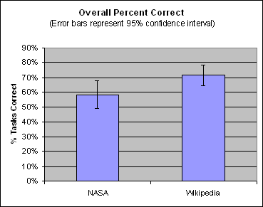
(In all graphs, error bars represent a 95% confidence interval for the mean.)
This difference was statistically significant, as indicated by t-test (p=.03). You can also look at task completion status by breaking it down into Correct, Incorrect, and Gave Up:
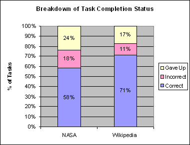
Note that the NASA site yielded both the higher percentage of wrong answers (18% vs. 11%) and of people giving up on a task (24% vs. 17%).
Finally, the accuracy data can be broken down by task:
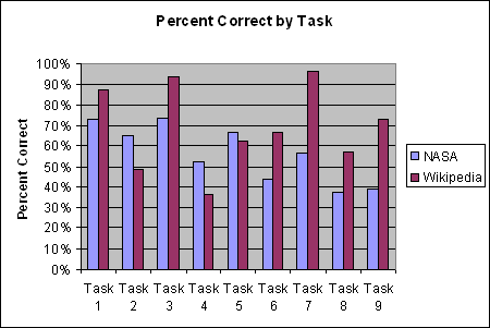
The tasks are as numbered in the list above. Clearly, some tasks were more difficult than others. Task 3 (Apollo mission that took the Earthrise photo) was among the easiest, while Task 4 (Apollo mission that was struck by lightning) was among the most difficult. In addition, the Wikipedia site had the higher percent correct for six of the tasks, the NASA site had the higher percent correct for two of the sites, and they were virtually tied for one task.
Overall, users of the NASA site had a mean time per task of 2.2 minutes while the users of the Wikipedia site had a mean time per task of 1.8 minutes, or about 23 seconds shorter, as shown here:
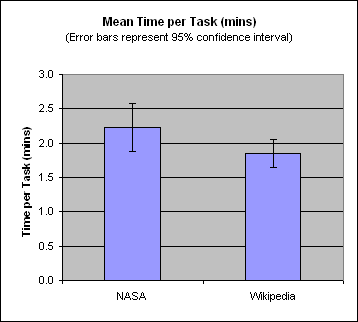
This difference approached significance, as indicated by t-test (p=.07).
The time data can also be broken down by task:
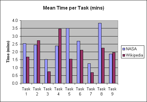
As with the accuracy data, some tasks clearly were more challenging than others. Tasks 3 and 7 were the fastest, while Task 4 (for Wikipedia) and Tasks 5 & 8 (for NASA) took the longest. In addition, the Wikipedia site had a shorter time for six tasks, the NASA site had a shorter time for one task, and they were virtually tied for two tasks.
One way of measuring task efficiency is to calculate the percent correct per minute, thus combining the time and accuracy data. Overall, the NASA site had an efficiency of 29% while the Wikipedia site had an efficiency of 46%, as shown here:
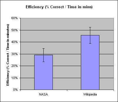
This difference was highly significant (p<.001).
Participants also rated how easy or difficult each task was on a 5-point scale (Very Difficult ... Very Easy), with higher numbers better. The NASA site received a mean task ease rating of 2.6 while the Wikipedia site received a mean rating of 3.1, as shown here:
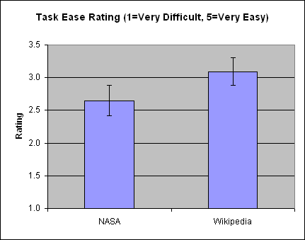
The difference was highly significant (p<.01).
The task ease ratings can also be analyzed by task:
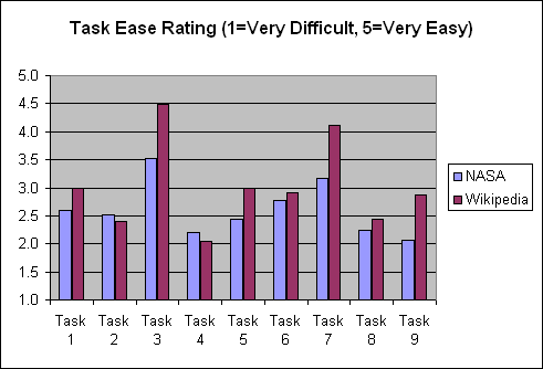
It appears that tasks 3 and 7 (which were also the fastest) were perceived as the easiest for both sites. For the NASA site, tasks 4, 8, and 9 were perceived as more difficult, while for the Wikipedia site, tasks 2, 4, and 8 were perceived as more difficult.
Note that the task ease ratings tended to be strongly correlated with task success (r= .81), task times (r= -.80), and task efficiency (r= .92).
After attempting their four tasks, the participants were asked to rate the site they had just used on two scales: Ease of Finding Information and Visual Appeal. Each rating was on a 7-point scale, with higher numbers better. Each rating scale also had an optional comments field.
The mean "Ease of Finding Information" rating was 3.0 for the NASA site and 3.9 for the Wikipedia site, as shown here:
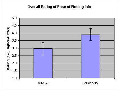
This difference was highly significant (p<.01).
You can also view the comments associated with this rating scale:
The mean "Visual Appeal" rating was 4.4 for the NASA site and 3.9 for the Wikipedia site, as shown here:
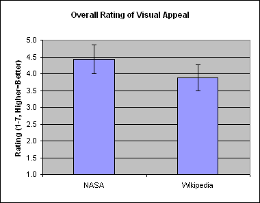
This difference approached significance (p=.06).
You can also view the comments associated with this rating scale:
Next was an open-ended question asking the participant if there were any particularly challenging or frustrating aspects of the website tested. You can view the responses to that question:
For the NASA site, two people explicitly stated that there was nothing particularly challenging or frustrating, while for the Wikipedia site, four people made a similar comment.
Next was another open-ended question asking the participant if there were any particularly effective or intuitive aspects of the website tested. You can view the responses to that question:
For the NASA site, fifteen people explicitly stated that there was nothing effective or intuitive, while for the Wikipedia site, only three people made a similar comment.
The final part of the study was the System Usability Scale (SUS), which consists of ten rating scales. A single SUS score is calculated for each participant by combining the ratings on the ten scales such that the best possible score is 100 and the worst possible score is 0. In essence, a SUS score can be thought of as a percentage of the maximum possible score.
The mean SUS score was 40 for the NASA site and 64 for the Wikipedia site, as shown here:
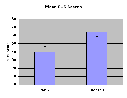
The difference was highly significant (p<.00001). Additional insight into the SUS scores can be gained from examining the frequency distribution of the SUS scores for the individual participants, as shown here:
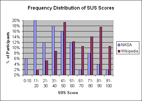
This makes clear the concentration of SUS scores toward the lower end for the NASA site and toward the middle and higher end for the Wikipedia site.
On almost every usability metric captured, the Wikipedia site came out superior to the NASA site: task success, task time, task efficiency, task ease rating, ease of finding information rating, and SUS score. The one exception was that the NASA site came out marginally better on the visual appeal rating. The detailed comments are consistent with these results and give much more insight into what aspects of the sites worked well or didn't work well.
The next step would be to identify usability findings from these results for both sites, especially any aspects of the sites that should be improved. For example, a number of comments, both positive and negative, about the two sites' Search functions were made. Suggestions for improving the Search functions could be derived from these. For now, I'll leave it as an exercise for the interested reader to see what findings could be derived!
Comments? Contact Tom@MeasuringUX.com.